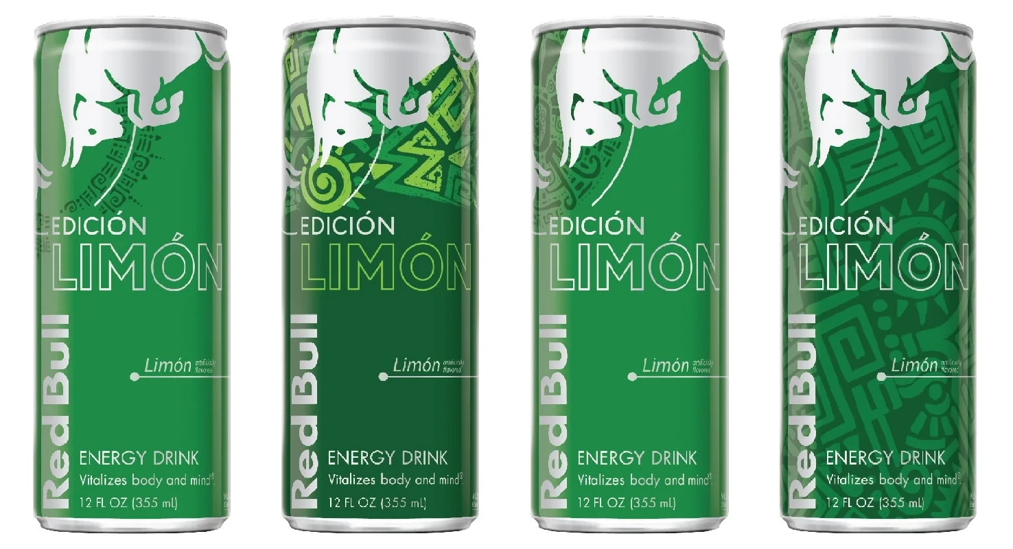
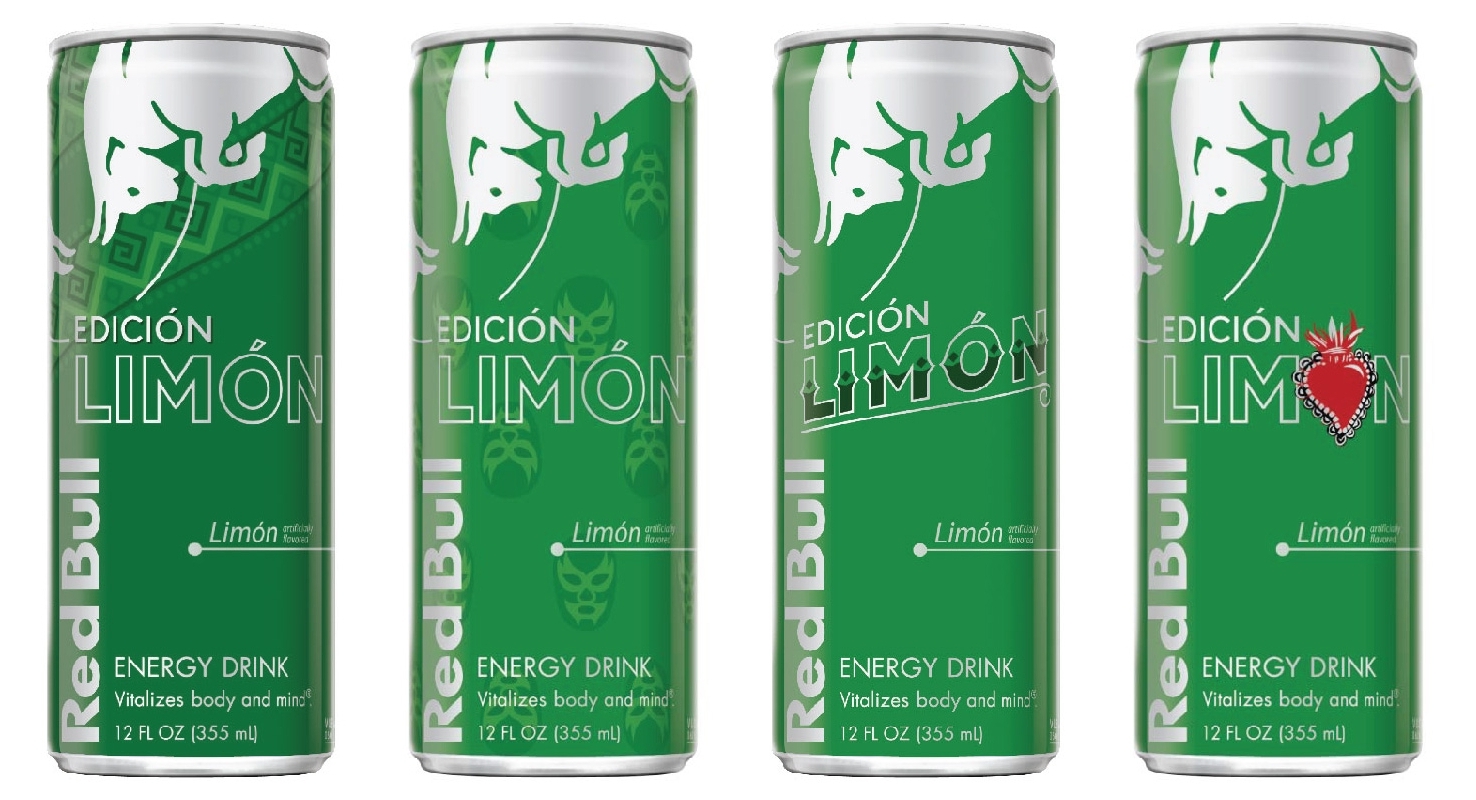
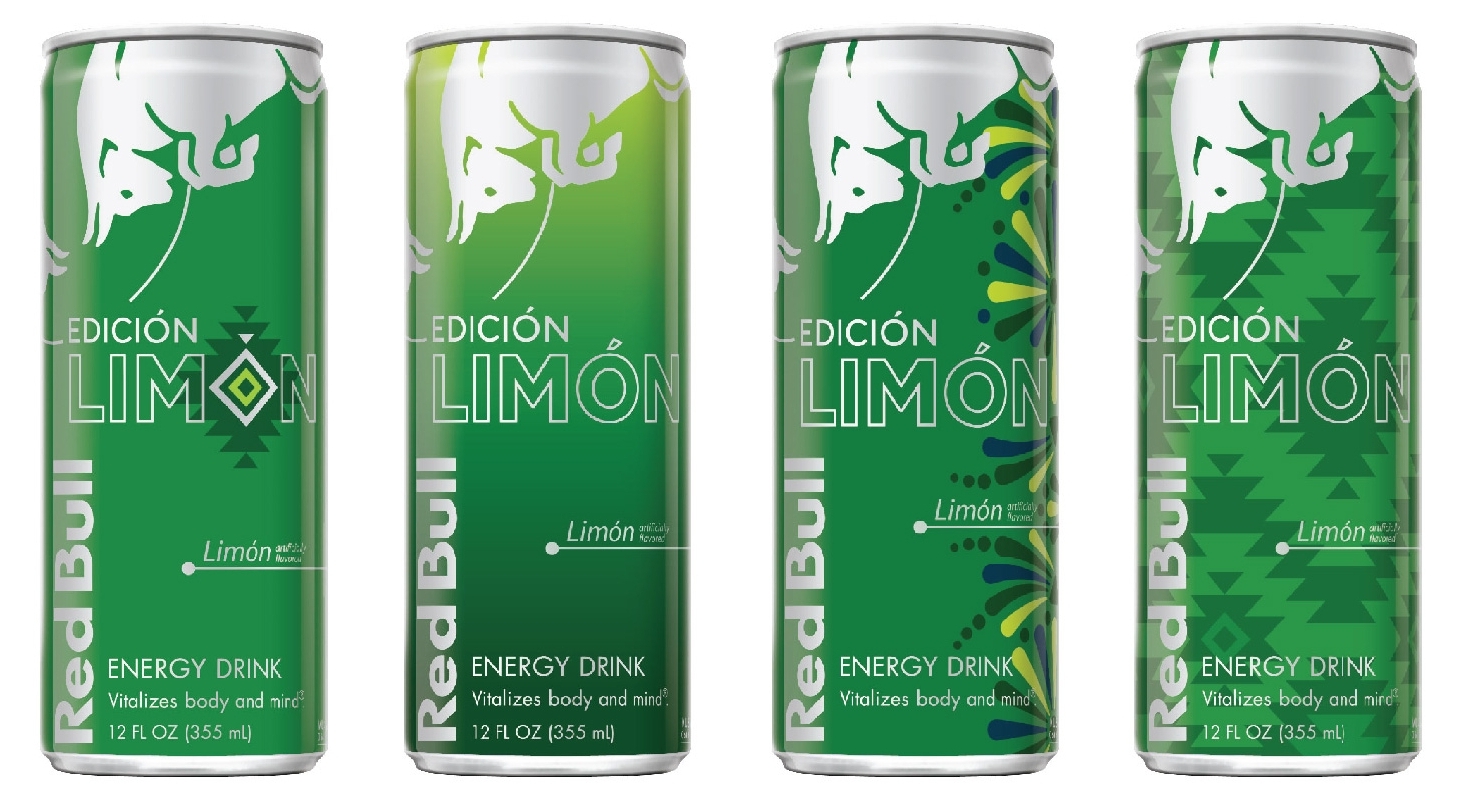
Red Bull Edición Limón
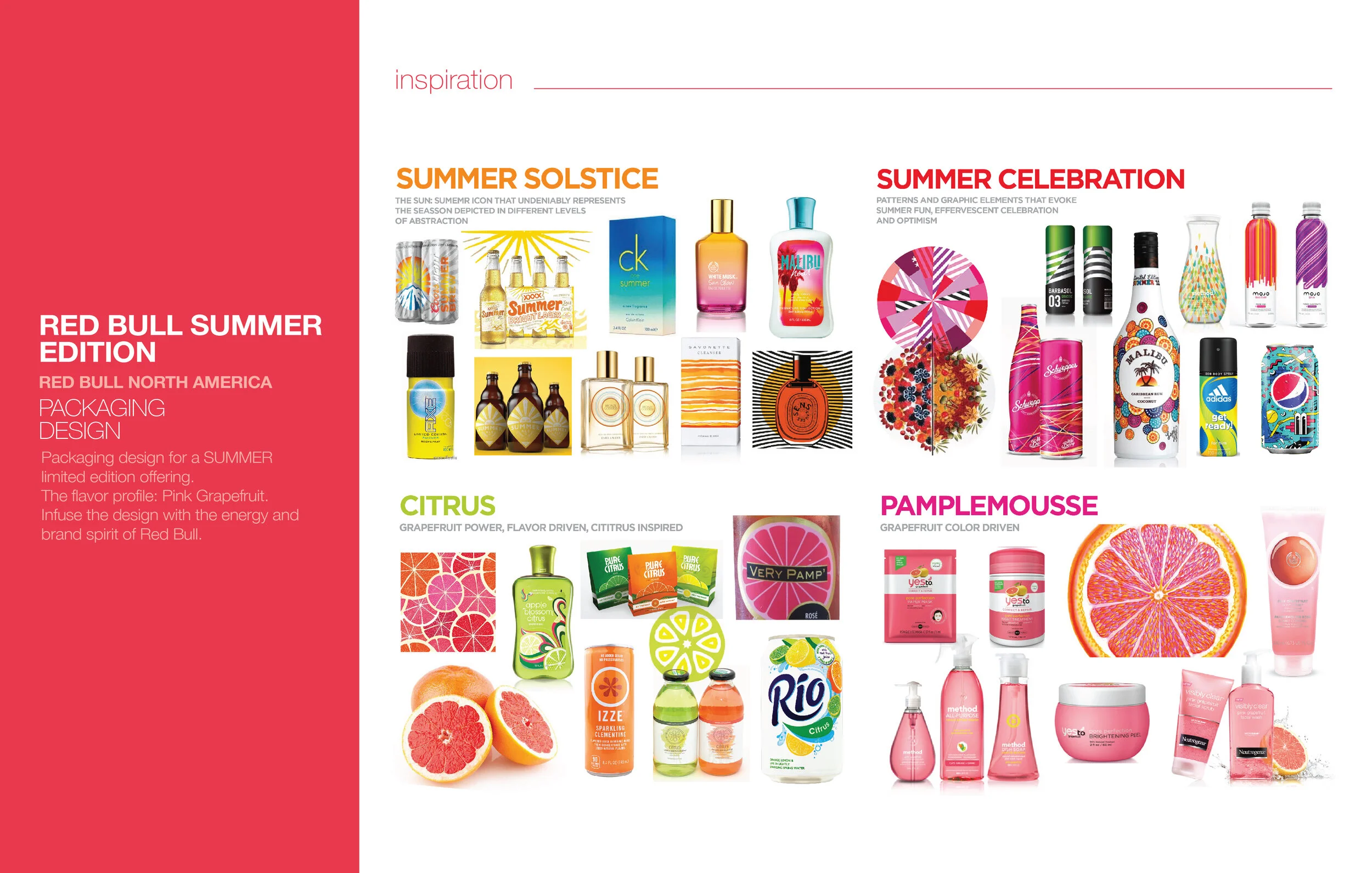
Launched as a Limited Edition, Red Bull USA creates their first-ever product targeted to hispanics. Based on their research hispanic consumers in the USA are a key contributor to their total annual gross. The strategy was to close the bonds with hispanic consumers by offering a relatable product inspired by their culture and traditions.
The creative challenge was to incorporate some latin flare into the very rigid brand architecture of Red Bull Editions. The solution was to translate in Spanish the key word on the pack that stands for the flavor and/or season (i.e. The BLUE Edition, The SUMMER Edition, etc.) and a colorful and energetic ring around the letter "O" a subtle reminiscent of the sun, the hispanic folklore, and the joyful spirit from hispanic culture.
The success of the product in the USA was significant enough that other countries in Latin America like Mexico made this product part of their permanent portfolio surpassing the limited edition mark.
Red Bull Sugar Free Editions
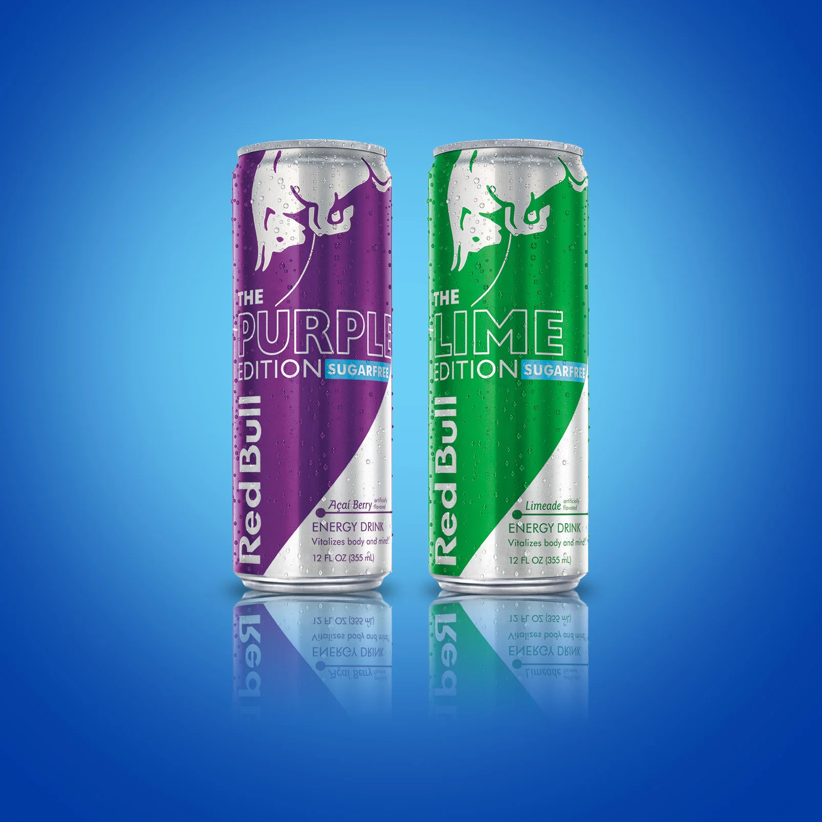
Sugar Free Editions was created as a response to fulfill consumer's demand for healthier options from the brand. The challenge was to differentiate this offering from the regular Editions and keep intact the rigid brand architecture. The solution was to cut out a wedge in the bottom that will reveal the metallic silver substrate signifying the "cut" in sugar, making also a visual difference from the regular Editions.
Other solutions included different shapes, patterns and the introduction of white as a good color to communicate sugar-free and differentiate from the rest of the portfolio.
Red Bull Spiced
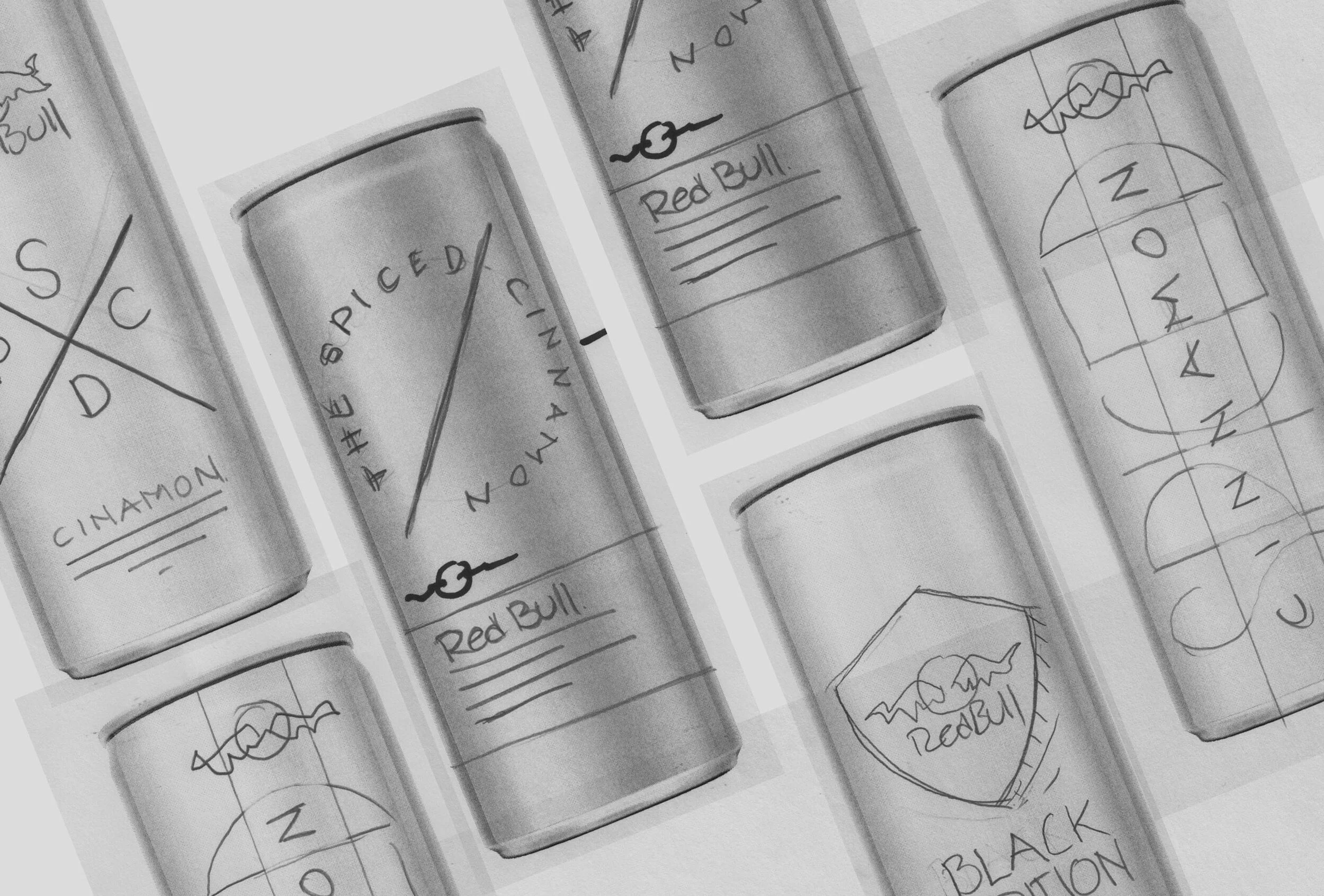
A big number of RB consumers mix it with alcohol, the brand acknowledges this and decide to test a concept that is based on the mixology trend. Using flavor profiles that inspire the creation of cocktails and libations the brand creates SPICED, an ultra-premium offering, a blend of spices with the energy of Red Bull. Endorsed by acclaimed mixologists and sold only on selected bars and restaurants.
The exploratory executed only one of the 3 intended flavors (cinnamon, ginger and jalapeño)
Red Bull Water
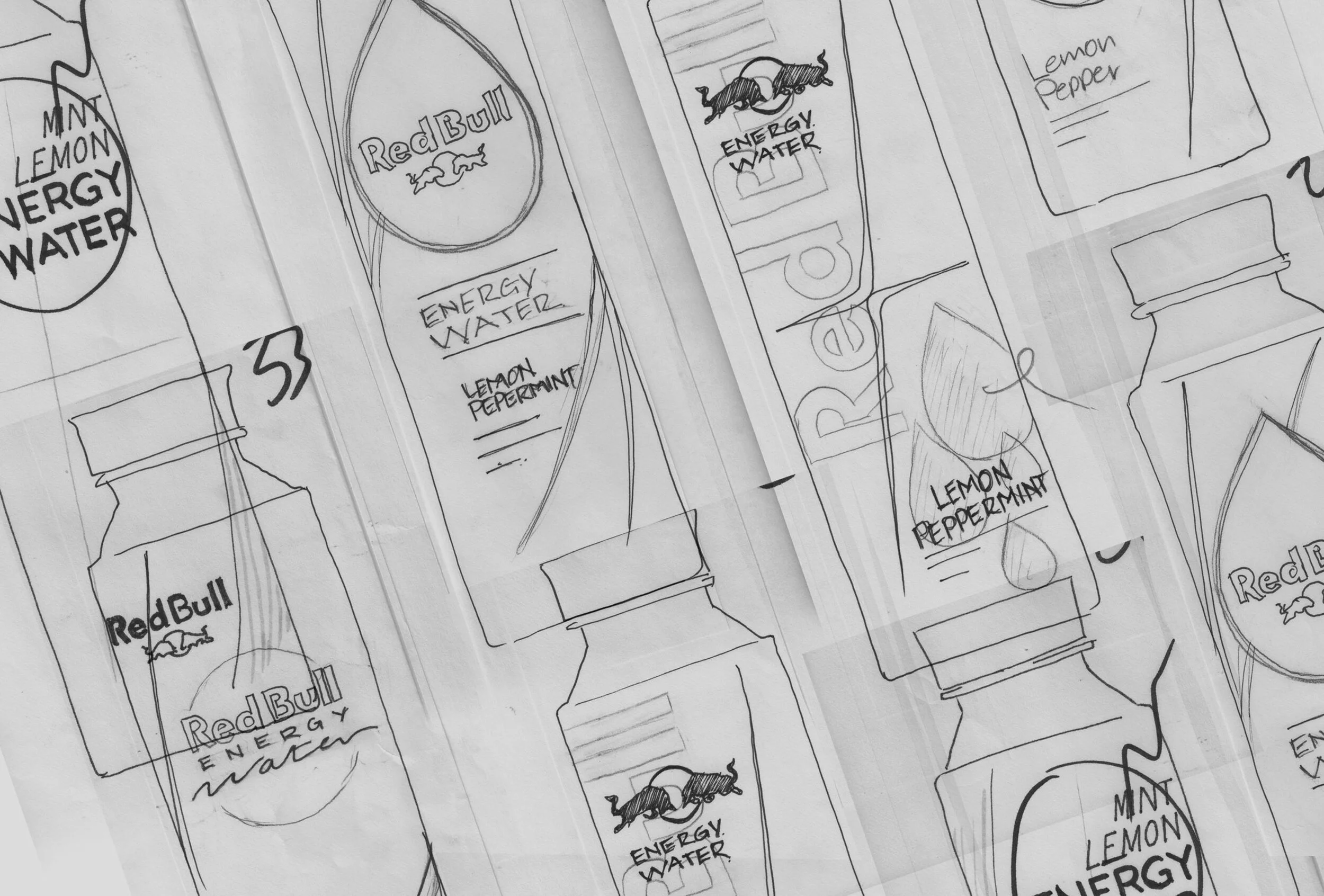
Packaging design for a premium flavored energy water. The challenge was to leverage the RB Editions architecture on new packaging structures and staying true to the brand’s personality while fitting in the water category. The graphics also needed to enhance and embrace each and every one of the sturctures given by the Red Bull Industrial Design Team.


